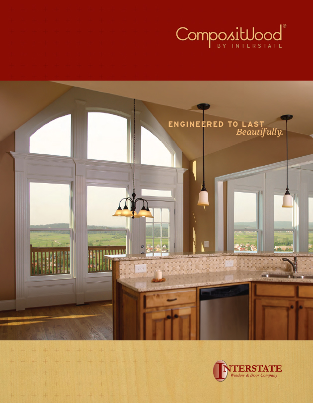
Brand identity created for a line of windows made from composite materials but designed to look like traditional wood windows.
The melding of the lowercase ‘t’ and uppercase ‘W’ reinforces the composite aspect of the windows, and subtly adds a plus sign to imply that the product is more than the sum of its parts.


